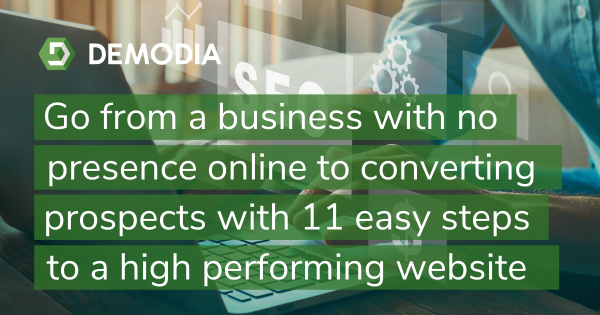
The internet is a big place, and you want to stand out. Not ranking on the first page of Google or offering a lacklustre website experience can both hurt your chances of business survival. However, so much goes into making a high performing website that you just feel lost and defeated. You need someone to show you how to engage with and delight your potential customers, going from a business with no presence online to converting new prospects with a tangible, online asset.
This blog post will give you easy pointers for optimising your website for high-value conversions. By following these 11 easy steps, you’ll go from not knowing what to do online to automatically nurturing and converting prospects through your website.
 STEP ONE - Highlight your value proposition.
This is one of the most important aspects of a website. You should ensure that you’re always conveying your value to your website visitors. For every page, think about what’s in it for them and why they should do business with you.
On every page - check that your copy, headlines and images all promote or prove your value to visitors concisely and convincingly.
It should - tell readers what they get out of your company and why you’re the best at it.
Be sure to avoid - long-winded explanations, confusing language and irrelevant detail.
The website visitor should - know exactly what your company is about, what they get and how to get it.
Elements to address - main headlines, images and copy.
STEP TWO - Speed up your website.
A slow website doesn’t do well for search engines or website visitors. You may have to get a little technical to speed up your website, but it’ll be worth it in the long run. There are a few plugins that you can use to help speed this process along, but you should be conducting an audit of all the assets on your website and evaluating their impact on your overall speed. You should always keep in mind the experience of your website visitor, and pages that take forever to load are something that should be avoided at all costs.
On every page - optimise images, combine files, enable compression and ensure you are using the right host.
It should - aim to eliminate loading bars, slow-loading images and lagging websites.
Be sure to avoid - having too many images, uploading unoptimised or uncompressed files or including unnecessary scripts or plugins.
The website visitor should - be able to quickly navigate your website and not have to wait for any loading.
Elements to address - images, plugins, uploaded files, resources and hosting services.
STEP THREE - Keep one main conversion goal per page
Your website is not a brochure - every page should have an actionable purpose. Note that we used the singular in that sentence. You want to try to keep things as streamlined as possible wherever you can. Ideally, you want to drive visitors to either enter the customer journey or go for the sale. If they’re not ready, you can have one or two alternative conversion actions down the page. The most critical element here is to avoid overloading your visitors.
On every page - ensure there is only one action you would like your visitor to do, and perhaps one or two secondary actions.
It should - help your visitors make decisions faster, enabling faster conversion.
Be sure to avoid - having too many distracting actions or any complicated and time-consuming steps for your visitors.
The website visitor should - know exactly what the action is, where it is and how to complete it.
Elements to address - call to actions, forms, links.
STEP FOUR - Add credibility and social proof to your website
Taking action on a website demands something of your visitors - whether it’s their time, money or attention. If you don’t make them feel secure in that they will get something out of it, they won’t bother with your website. Social proof and credibility are among the best ways to do this, so try to encourage readers with stories of success and testimonials.
On every page - ensure there is at least one testimonial, rating, review or endorsement of some kind.
It should - inspire confidence in your product for your visitors.
Be sure to avoid - leaving too many disclaimers or including friction such as complicated steps, loading times or contradictory content.
The website visitor should - feel rest assured that they are making a safe, effective and valuable decision when using your product or website.
Elements to address - customer testimonials, ratings and reviews, social media praise, endorsements, logos, awards.
STEP FIVE - Simply your website navigation
Your visitors should never be confused about what to do next, so try to streamline your ideal website experience. A significant element of this is to limit the possible assets and buttons your visitors can interact with.
On every page - there should be a clear path for your visitors, and each page should have a link to important pages such as the pricing page.
It should - aim not to overwhelm your visitors with choices and give them clear direction on what they should click through to next.
Be sure to avoid - unnecessary pages, irrelevant resources or pages without a link.
The website visitor should - be able to navigate your website quickly and easily without wondering where to find what they are looking for.
Elements to address - links, menu bars, website map, website pages.
STEP SIX - Write for skimmers
Almost no one wants to sit and read a website for an hour. In fact, most visitors just skim for the information they want. Therefore, try to make your most important points stand out and be easily digestible with bullet points, stand-alone paragraphs and headings.
On every page - ensure your copy is not too long on each page, perhaps reaching a maximum of 1000 words.
It should - aim to get core messages across quickly and in an easily digestible way.
Be sure to avoid - long paragraphs, run-on sentences, complex vocabulary.
The website visitor should - be able to understand (in general) what each page is about in 15-30 seconds at a glance.
Elements to address - summary introduction, headlines, bullet points,
visible call to actions, images.
STEP SEVEN - Be responsive
A lot of your visitors will be tuning in from mobile devices. There’s no excuse for losing these visitors due to a poor performing, unresponsive website. Make sure that your website is easily accessible and usable off a small screen, and never ask your mobile visitors to scroll to the side.
On every page - optimise the content for mobile - compress images, ensure it has a responsive design, limit copy.
It should - be readable from mobile devices and on small screens.
Be sure to avoid - long paragraphs, unresponsive images, large files.
The website visitor should - be able to easily navigate your website from their mobile phone without scrolling sideways.
Elements to address - design, images, copy.
STEP EIGHT - Eliminate jargon
Industry jargon doesn’t make you seem smart - it makes you seem obnoxious. Every experience on your website should make your business appear to be approachable, friendly and trustworthy. Jargon flies in the face of all that, so try to get rid of it wherever possible.
On every page - check for and replace any complicated or industry-specific words unless absolutely necessary.
It should - help readers understand your core offering without possibly confusing them by focusing on value - what does it all mean for them?
Be sure to avoid - complicated vocabulary, industry jargon, complex terminology.
The website visitor should - be able to quickly understand your copy without having to look anything up.
Elements to address - copy, headlines, resources.
STEP NINE - A/B Test
Your website is filled with ‘moments of truth’ where your visitors will either perform the action you want or leave. You should A/B test different styles of these moments wherever possible to find the best performing elements and incorporate them into the rest of your website.
On every page - A/B test important aspects like call to actions, forms and headlines.
It should - help you understand what your visitors respond to and find out what works.
Be sure to avoid - A/B testing too many aspects at once - try to stick to one hypothesis at a time.
The website visitor should - not notice the difference and naturally use what appeals to them.
Elements to address - copy, headlines, resources, call to actions, images, keywords.
STEP TEN - Remove distractions
Your website should always perform a function - not simply be a digital billboard for your company. Thus, any irrelevant information or images should be removed unless they drive users to understand your company more or perform an action.
On every page - Remove or minimise everything that is not relevant to users taking the action you want them to take.
It should - encourage your visitors to become less distracted and more focused on converting.
Be sure to avoid - removing relevant images or vital copy - only seek to remove anything that is more distracting than the call to action you have in place.
The website visitor should - have their main focus on the action you want them to take without being distracted by large images, big headers or huge menus.
Elements to address - headings, irrelevant images, big sidebars, non-shrinking menus, irrelevant interactive elements.
STEP ELEVEN - Improve your page forms
Forms are essential for conversions, and thus deserve attention when optimising your website. Visitors often leave your website if a form asks for too much information or otherwise takes too long to complete. The trick is to find the sweet spot between gaining as much information as possible while driving away as few visitors as possible.
On every page - Cut down on forms that ask for too much information, have excessive fields or take your customers too long to complete.
It should - focus on asking for a few details at a time - with email addresses the highest priority. Split longer forms into smaller ones throughout your website.
Be sure to avoid - asking for information that you will never or only rarely use. Only ask for relevant information.
The website visitor should - never have to spend longer than 2-3 minutes in filling out any single form.
Elements to address - forms
Let us show you the way
If you want to be an organisation whose website is a central asset, you need to start with an experienced web developer that understands the sales and marketing process. We understand that finding the right developer is a frustrating and time-consuming process, which is why we have spent the last 12 years designing, developing and maintaining high-performing websites for dozens of B2B clients worldwide.
We give you everything you need to build a high performing website - developers included. Start with taking our free website audit and watch as your search rankings, traffic and online leads increase.
Here’s how we do it:
- Book your consultation - During this free online meeting, we will discuss your current sales and marketing campaigns and goals.
- Build a campaign - We will give you an integrated marketing campaign plan, providing you with the messages, channels, audience, and content to use.
- Grow your business - Watch your new leads increase and your business grow through effective integrated campaigns.
Contact us today and turn your website from an unknown online presence to a digital asset for automatic conversions.