When I say Coca-Cola, Uber, Skype, or Facebook, what comes to mind? Most people don’t immediately think of brown sugar water, driving with a stranger, calling grandma, or looking at her photos - first, they think of logos, and each of them has one thing in common: a very specific font.
The marketing world isn’t a deep dive into hidden meanings and convoluted conspiracies. This isn’t the History Channel. In marketing, what you see is what you get - and the first thing that people see is often the name of your company, or more specifically, the font that you use. As your in-laws will often remind you, you never get a second chance at making a first impression which is why it’s critical to use the right font for your brand and products if you want to attract the customers you want.
But what font should you use? Read on to find out as we explore how to choose the right font for your brand.
There’s nothing ‘comic’ about Comic Sans
Before we start talking about which fonts you should use, it’s helpful to talk about which you shouldn’t.
Choosing the right font is all about encapsulating the spirit of your brand and business. Just like you wouldn’t expect a lawyer to meet you in a bathing suit, no one wants to see a font that fails to match the company it represents. For example, compare NASA’s original logo with the other that simply replaces the font with Comic Sans. Would you trust a company that uses Comic Sans to launch you into space and bring you back safely?


This is because the font you choose says something about your company and how your customers view it. You have to choose a font that compliments your brand so that your customers will have an accurate perception of your company.
There are over half a million fonts to choose from, so it may seem like choosing the perfect one for you will be a grueling task. Luckily, they all fall into specific font categories and as business owners, you only need to think of two - Serif or Sans serif.
Who’s the Serif around here?
Most instantly recognizable brands choose fonts that fall into the Serif or Sans serif font categories. Understanding the difference between the two will be the first step you take in selecting the right font for your own brand.
Recognizing the difference between the two is pretty simple once you know what a serif is.
A ‘serif’ is a decorative stroke that finishes off the end of a letter. They may look like ‘feet’ on a letter. Serif fonts have these strokes or ‘feet’ while Sans serif fonts do not - the hint being that ‘sans’ in French literally means “without”.
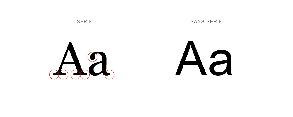
For such a tiny change, these two fonts project entirely different messages, personalities, and impressions. If you want your brand to stand out, you will have to choose the style and font that aligns with the spirit and personality of your brand.
Serif - the suite and tie font
What spirit does it embody?
- Serious
- Traditional
- Sophisticated
- Established
- Classical
- Elegant
What industries could benefit from it?
- Law practices
- Editorials
- Insurance
- Premium products
- High fashion
- Medical practices
- Financial
Ten best font examples
- Times New Roman
- Garamond
- Baskerville
- Georgia
- GT Sectra
- Freight Text
- No To
- Ogg
- Bookmania
- Span
Companies who use it
- Vogue
- JP Morgan
- Honda
- Burberry
- Sony
- Prada
- Rolex
- Yale university
- New York Times
- Virago
Serif fonts have a lot of history attached - more specifically, Roman and Greek history.
Serifs originated from the first official Greek writings on stone and in Latin alphabet with inscriptional lettering, or words carved into stone in Roman antiquity. Many scholars have theorized that serifs were devised to neaten the ends of lines as they were chiseled into stone.
While interesting, for our purposes, we only need to know how the font makes readers feel and what it would mean for your brand. We see a lot of serif fonts used for mediums that want to be taken seriously - like magazines, newspapers, and books. This is why they’re often used by companies who want to exude these traits.
In other words, a serif font means business. Companies who use serif fonts want to give the impression of a classical, established, and trustworthy brand. Some of the feelings that this font evokes are elegance, confidence, and trustworthiness.
This means that serif fonts make a good fit for companies who want to appear established and serious like law practices, editorials, and insurance companies. The best serif fonts tend to be Georgia, Garamond, Times New Roman, and Baskerville.
Sans Serif - the t-shirt and jeans font
What spirit does it embody?
- Modern
- Simplicity
- Approachable
- Clean
- Friendly
- Casual
What industries could benefit from it?
- Start-up tech companies
- Fitness
- Entertainment
- Entry-level products
- Casual fashion
- Electronic companies
- Fast food
Ten best font examples
- Open Sans
- Helvetica
- Futura
- Arial
- Calibri
- GT Walsheim
- Brandon Grotesque
- Gilmer Sans
- Roboto
- Lato
Companies who use it
- Spotify
- Netflix
- Adidas
- Airbnb
- Amazon
- Subway
- Jeep
- Walmart
The first Sans serif font was designed in 1816 by William Caslon IV - to much opposition. Sans serif was seen as immature and ungainly. It was only during the advent of modernism at the turn of the century did Sans serif truly take form, with some of the most popular and recognizable fonts being created. Futura, Helvetica, and Univers were all created between 1920s and 1970s, making some of these relatable, casual, and modern-looking fonts nearly a hundred years old!
Today, unlike in the 1816s, we have less time than ever to connect to our audiences. We have to create messages and brands that are appealing, accessible, and digestible as possible, and with an inundation of marketing messages, people screen for what they find engaging and ignore brands unless they are personally invested in the message.
Sans serif excels at this where the central modernist ideals of simplicity and efficiency prevail. Companies that want to appear approachable, friendly, and simple like social media organisations, entertainment businesses, and fast food enterprises all use Sans serif to give people a sense of being familiar and more humanistic.
In short? Sans serif wants to be your friend. Companies who use sans serif fonts want to give the impression of being casual, informal, friendly, and very approachable. This font evokes the feelings of being modern, relaxed, fun, and relatable.
This means that sans serif fonts make a good fit for companies who want to appear youthful and casual like fitness, entertainment, and technology companies. The best sans serif fonts tend to be Arial, Calibri, Helvetica, and Open Sans.
To Serif or Not to Serif?
If you’re wondering which is superior, the answer is neither.
Both Serif fonts and Sans serif fonts have their strengths and weaknesses, and you’ll need to choose one which exemplifies your brand. Of course, many companies have made the switch to keep up with the times - you only need to look at Google and Apple to see this evolution.
In general, you want to use Serif fonts for more serious businesses and Sans Serif for more approachable businesses. But what about the font itself? Here are a few pointers to help you decide which font could be a good fit which we’ve included below.
Choose one font and stick with it.
Uniformity is key when building a brand. Multiple fonts can make your website look amateurish and confusing. At most, you want to have three fonts - with one primary being the focus.
If you use more than one font, look for contrast
Fonts with shared qualities perform better together than fonts from completely different families. You want to look for fonts that have a similar letter height or width or fonts that are created by the same designer.
Look for a font with multiple weights and styles
Fonts that have multiple weights and styles can be used to communicate vastly different messages while still appearing uniform, neat and professional.
Readability is critical
No matter what font you pick, you should always keep your reader in mind. At all times and in all sizes, your font should be easily read and recognised.
Be a Font-runner
Fonts are only the beginning of great design and are only as good as the company that backs it up. While a font can help you stand out, you need to back it up with memorable messaging, marketing, and service to solidify your brand and achieve success.
If you would like to achieve success with your digital marketing or branding, consider Demodia. Demodia is a European digital marketing company that has achieved excellence for their clients around the world. With decades of experience, the Demodia team understands what works and what doesn’t in the world of modern digital marketing.
Contact us today and discover how we can make your business stand out and achieve success.